Experimental details

Experimenteel

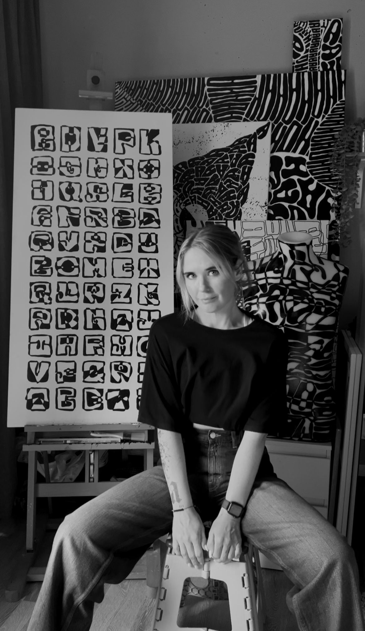
Laura Ketting is an experimental artist and designer based in Rotterdam.
Her practice revolves around typography, not in the traditional, functional sense, but as a visual language in itself. She works intuitively, using black-and-white compositions, physical materials, and a process-driven approach to explore what letters can become when readability is no longer the goal.

For Laura, a letter doesn’t have to be understood, it needs to be experienced.
She strips her work down to the essentials: shape, contrast, rhythm, structure. By removing color and context, she invites the viewer to focus on the visual qualities of type, the things we usually overlook because we’re too busy reading.

She often starts with an idea, but allows the work to shift and reshape along the way. It’s a method built on instinct and trust: trusting the material, the process, and the idea that unexpected outcomes are often the most valuable ones.

Mistakes aren’t something to avoid, they’re part of the work. They open up space for surprise, for depth, for something new to emerge.

Whether she's working on a print, an installation, or a workshop, Laura’s aim is to offer space. Space to see differently. Space to let go of fixed meanings.
To find something in a letter you didn’t expect.

By making you will see. By seeing you will make.
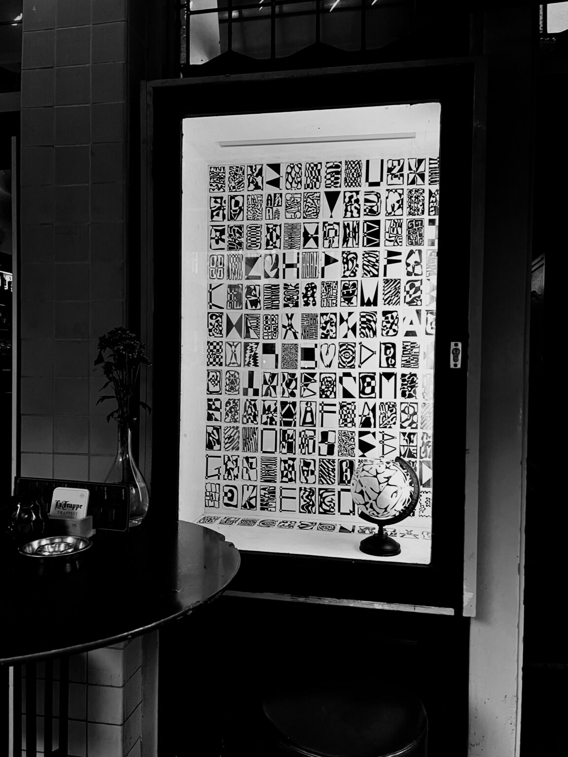
Expositie De Schouw
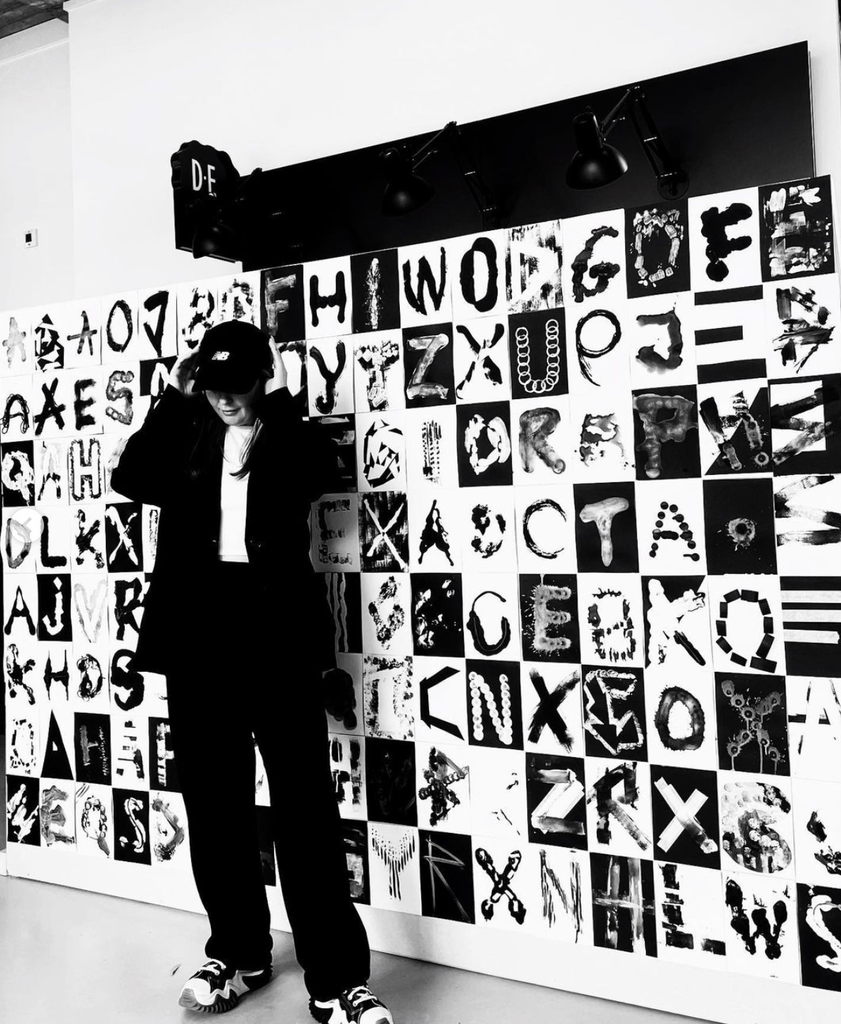
Expositie De Schouw - Hidden Letters – A Window into Abstraction For this window exhibition at Café De Schouw, I created 156 miniature artworks, each centered around a single letter. At first glance, the letters dissolve into abstract forms, almost unrecognizable. But as you take a step closer, the shapes begin to reveal their meaning. This project plays with the boundaries between typography and abstraction, challenging the way we perceive language and form. Just like the city itself, these works require time and attention to fully uncover their details. They reflect the layers of urban life, sometimes chaotic, sometimes structured, but always telling a story. Displayed in the window of Café De Schouw, this exhibition transforms the everyday act of passing by into a moment of discovery. Will you take the time to read between the lines?
LOST IN LETTERS
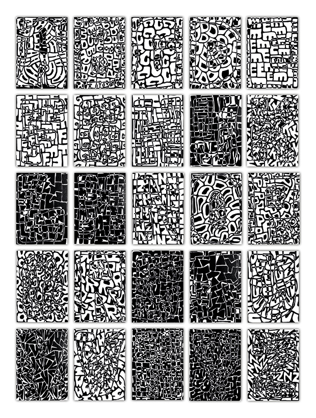
LOST IN LETTERS - Letters of Justice – An Invitation to See Beyond The courthouse is a space where countless stories intertwine, some complex, others simple. Every person who enters carries their own narrative, shaped by circumstances, choices, and fate. For this exhibition, I created 25 paintings, each dedicated to a single letter of the alphabet. At first glance, these pieces appear abstract, but as the viewer lingers, letters begin to emerge. Each composition is constructed entirely from its designated letter, a bold form at the center, filled with countless smaller variations of itself. This layering of type and form invites curiosity. The longer one observes, the more the meaning shifts, letters become shapes, words dissolve into patterns, and new interpretations arise. Through this work, I challenge the viewer to question: What am I actually looking at? Just like the cases that unfold within these courthouse walls, perception is subjective. Meaning is not always immediate; it takes time to uncover the full story.
Experimental Alphabets
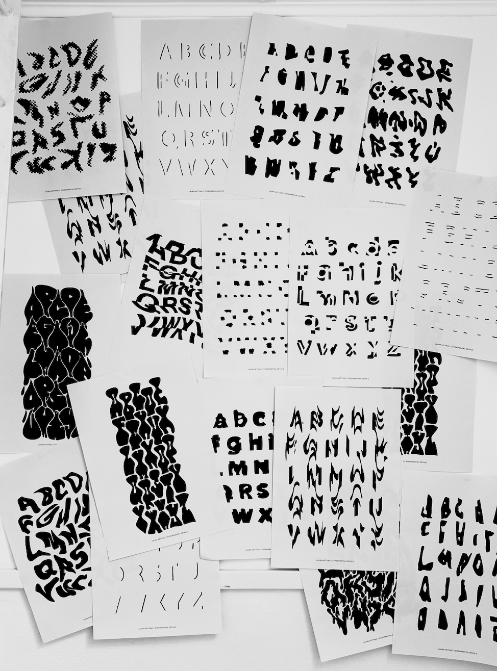
Experimental Alphabets - EXPERIMENTEEL ALFABET is een groeiend archief van typografische studies. 16 posters, elk gebaseerd op één alfabet, gevormd door intuïtie, vervorming en imperfectie. Elke letter in deze alfabetten is opgebouwd zonder regels of rasters. In plaats van letters ontwerpen om gelezen te worden, heb ik gekeken naar hoe letters zich kunnen gedragen. Elke print is een momentopname van een andere benadering: Het ene alfabet voelt ritmisch, het andere chaotisch. Sommige zoeken herhaling op, andere verkennen gebaar, ruis of stilte. Maar ze stellen allemaal dezelfde vraag: Wat gebeurt er als we stoppen met het maken van een ‘bruikbaar’ lettertype, en de vorm het over laten nemen?
Talent Spotlight
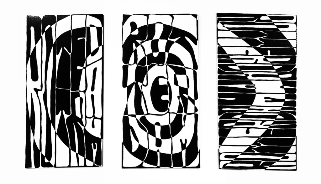
Talent Spotlight - Talent Spot Rotterdam – An Ode to the City For Talent Spot Rotterdam by Kunstuitleen Rotterdam, I created three abstract works as a tribute to the city. Each piece contains the word ‘Rotterdam,’ hidden within the composition. In my signature style, I play with forms and contrasts, making the letters merge with the artwork. At first glance, the pieces appear as graphic patterns, but those who take a closer look will uncover the city’s name. These works are an ode to Rotterdam, a city in constant motion, just like the dynamic lines and structures in my art.
Getir Store
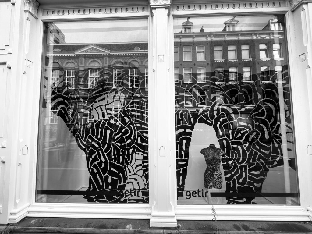
Getir Store - In 2022 I was selected by STRAAT Museum as one of four artists to transform several Getir store windows in Amsterdam into temporary art installations. The aim was to turn everyday, overlooked spaces into "art stores", replacing commercial repetition with visual experimentation. I created a large black-and-white typographic window painting, working directly on the glass with an intuitive, hands-on process. The result challenged the boundary between public space, signage and visual art.
Material experiment
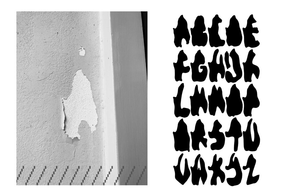
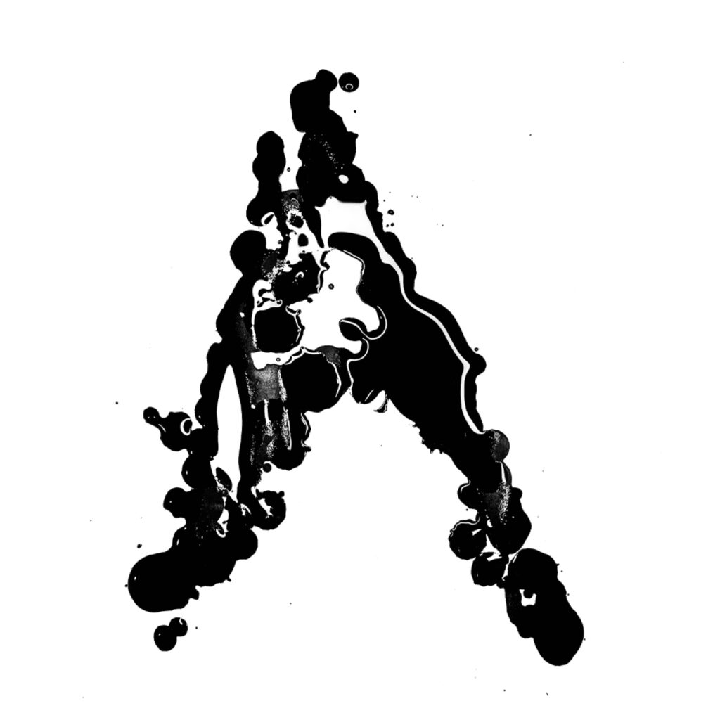
Material experiment - Experimental Typography – A Material-Based Approach For the Maker Faire at TU Delft, I conducted a two-day material research project, exploring how different materials and techniques influence the form of letters. Each letter became a unique result of its process, shaped by texture, fluidity, resistance, and unpredictability. Even when recreating the same letter, no two outcomes were identical. This project was not just about creating type; it was about experimenting, playing, and embracing imperfection. Visitors were invited to take part in the process, allowing them to explore typography as a hands-on, interactive experience. The result? A dynamic and ever-evolving collection of letters, each telling its own story. Through this approach, I aimed to break traditional boundaries of type design and highlight the endless possibilities of material-driven creativity.
Street alphabet
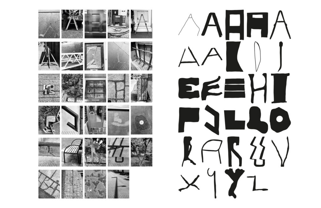
Street alphabet - Urban Typeface – Constructing a City Alphabet In this project, I took my exploration of urban typography a step further by developing an entire typeface from letterforms found in the city. By walking through the streets, I photographed objects, structures, and patterns that naturally resembled letters. The challenge was not just to capture these forms but to transform them into a cohesive alphabet, applying consistency while preserving the raw, organic nature of the shapes. Each letter in this typeface carries a sense of place, shaped by urban textures and accidental design. The process of refining and unifying these diverse forms resulted in unexpected yet structured outcomes, where abstraction meets readability. This project highlights my ongoing fascination with the intersection of environment and typography, proving that letters can be found, not just designed. By embracing research, experimentation, and adaptation, I continue to expand my visual language and push the boundaries of typographic exploration.
Street Type
Street Type - In this project, I explored letterforms in the urban landscape. By walking through the city, I captured everyday objects, structures, and cracks in the pavement that resembled letters. These found shapes were then traced and refined, leaving only the pure essence of the letterforms I saw. This process resulted in a unique typographic study, where letters emerged organically from their surroundings. Each form became an abstraction, both recognizable and unexpected, enriching my perspective on typography and its endless possibilities. Research, experimentation, and process are central to my work, and this project reflects that. By deconstructing and redefining letterforms, I continuously expand my visual language, applying these discoveries to future designs.
The unexpected typeface
The unexpected typeface - The Unexpected Typeface Video work by Laura Ketting This video offers a look into my way of working as an artist and designer. In it, I share my thoughts on typography, process, and how I approach the act of making. I work with letters, not to make them readable, but to explore what they can become when you let go of control. It’s about seeing differently, discovering things in form, and trusting what happens when you allow the process to lead. The video combines visuals of my work with a voice-over that reflects my personal approach: intuitive, experimental, and focused on form, contrast and rhythm. It’s not just about the outcome, it’s about how you get there.
Mural - Beat Fabriek
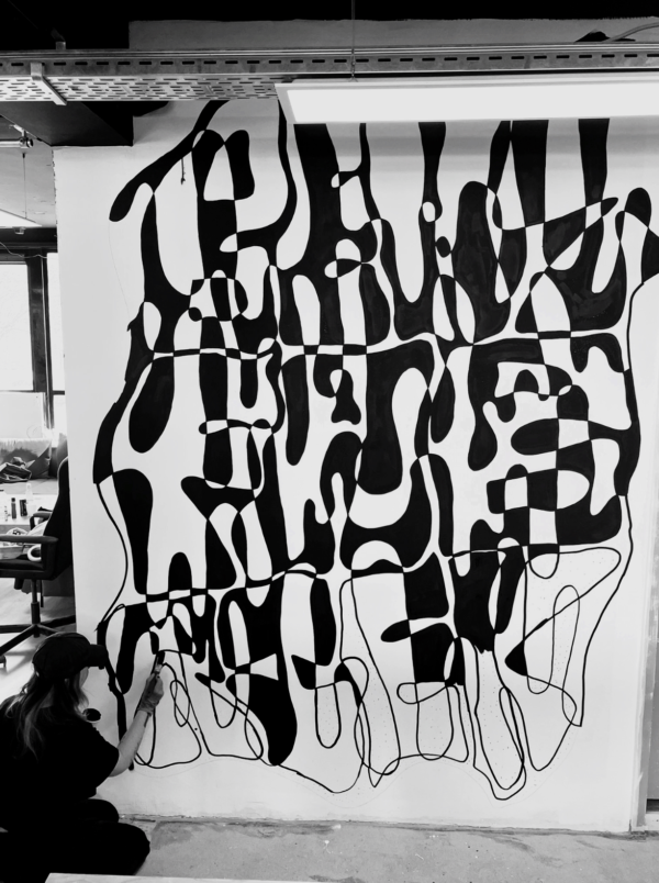
Mural - Beat Fabriek - De Beatfabriek – Visualizing Sound & Creativity For De Beatfabriek, a space filled with music studios and DJs, I created a mural that blends typography with abstract rhythm. The name “De Beatfabriek” is embedded within the artwork, painted in my signature style, intentionally obscured, encouraging discovery. The flowing lines in the mural are inspired by sound waves and creative energy, representing the way music takes shape within this space. Just like the artists who bring their beats to life here, this mural is an expression of movement, spontaneity, and artistic freedom. This piece is a tribute to the raw, creative force that thrives within De Beatfabriek, a space where ideas turn into sound and music transforms into art.
Club Centraal Rotterdam
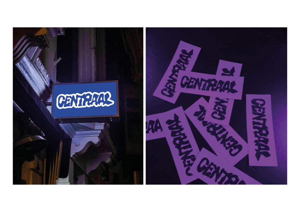
Club Centraal Rotterdam - Club Centraal – A Handcrafted Identity For Club Centraal, a nightclub in Rotterdam, I designed a unique logo that merges my graphic design background with my artistic style. The word “Centraal” was entirely hand-drawn, resulting in an organic, bold, and dynamic type treatment that reflects the energy of the club. By combining typography and abstraction, I aimed to create a visual identity that feels alive, fluid, and immersive, just like the nightlife experience itself. The handcrafted nature of the design adds a raw and authentic edge, making it stand out from digitally generated logos. This project was an exploration of how art and branding can merge to form something visually striking yet deeply personal.
Solo Expositie HIJS kamer
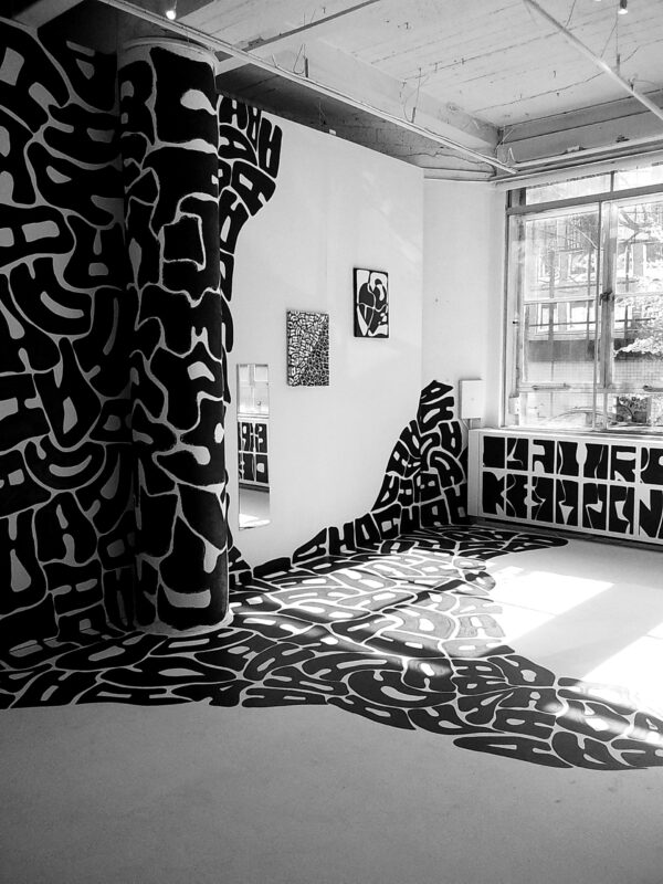
Solo Expositie HIJS kamer - Immersive Typography – A Spatial Experience For my solo exhibition at the HIJS Kamer, I transformed the space into a fully immersive artwork, where walls, floors, and canvases merge into a single experience. Through large-scale murals, sketches, and paintings, I explored all facets of my artistic style, breaking the boundaries between typography and abstraction. By extending my work beyond the canvas and onto the physical space, I invited visitors to step inside the art rather than just observe it. The layered compositions and bold contrasts encourage exploration, asking the viewer to not only see but experience the artwork. This exhibition was an experiment in how art can transform a space, making it not just a gallery, but a place to feel, move through, and decode.
Live Painting STRAAT Museum
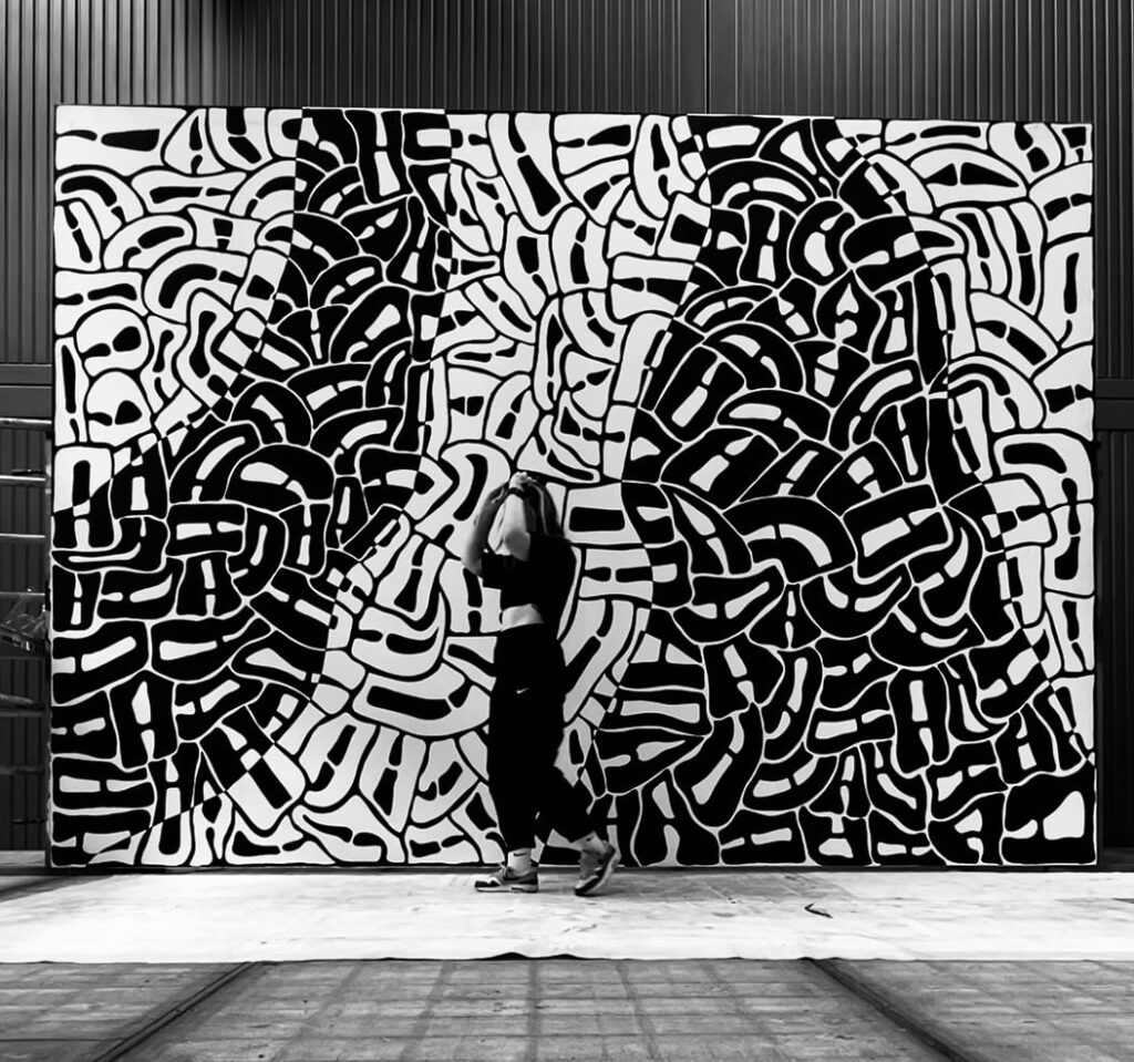
Live Painting STRAAT Museum - In 2022 I was invited to create a live painting at STRAAT Museum in Amsterdam as part of a multidisciplinary event featuring music, light and dance. Together with the performers, we created a fully immersive experience, responding to each other in real time. I painted a large-scale black-and-white typographic work directly onto the wall, guided by rhythm, movement and intuition. The process was raw and open, with every gesture becoming part of the composition.
“Analog Touchscreen”
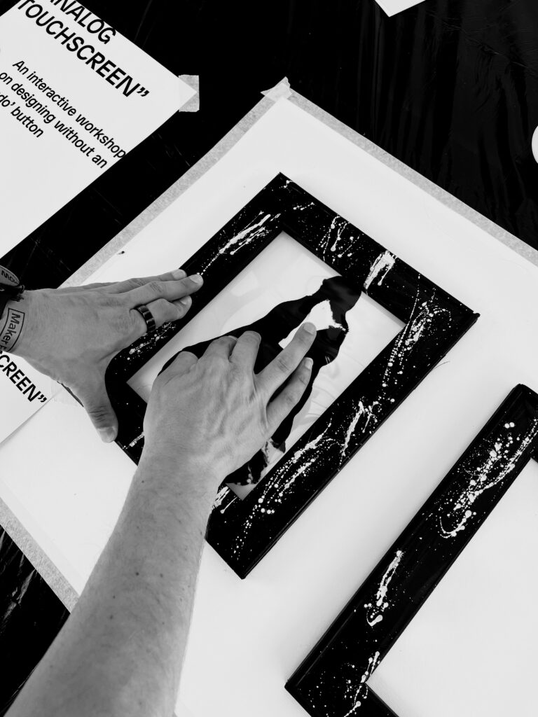
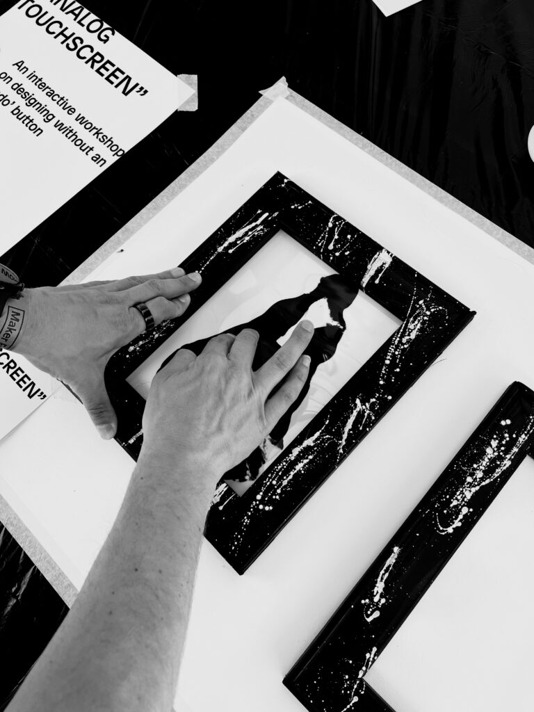
“Analog Touchscreen” - Analog Touchscreen – Interactive In a world where digital design gets smoother and faster, we often forget what makes creativity truly thrilling: mistakes. Modern tools let us correct, rewind, and erase endlessly. But what if you couldn’t? What if every mark you made was final? Analog Touchscreen invites you to create without an undo button. No layers. No filters. No escape. Just you, your hands, the material and the moment. You’ll work intuitively with analog tools that embrace imperfection. Every smudge, slip, or unexpected turn becomes part of the process. And those “mistakes”? They might just lead to something new. Something brilliant. Dare to make a letter you can’t undo?
Streeters Gallery NYC
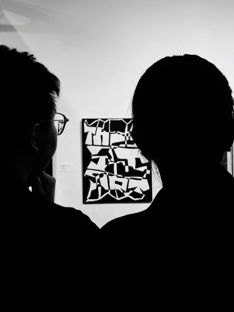
Streeters Gallery NYC - Streeters Gallery – Brooklyn, NYC Exhibited work: THIS IS ART In March 2025, my work THIS IS ART was exhibited at Streeters Gallery in Brooklyn, New York. The piece is a typographic composition that, at first glance, appears abstract, until the viewer takes a moment to truly look. Hidden within the layered forms is the phrase “this is art” but it takes time to reveal itself. Like much of my work, it plays with perception and expectation. We often search for immediate meaning, but the most beautiful things in life ask for patience. This piece invites the viewer to pause, look a little longer, and discover what is quietly waiting to be seen.

Publicatie werkmethodes

Datum:
Locatie: Rotterdam / China

I’m creating a publication that shares my experimental approach to typography, focusing on form, process and the unexpected. It combines my artworks, work methods and way of thinking, and will be used both as an independent art object and as a tool to support exhibitions and workshops. A tactile, black-and-white publication that invites others to see letters differently.

https://lauraketting.nl/project/analog-touchscreen-2/
Deze kunstenaar heeft nog geen toekenningen.